ShopDreamUp AI ArtDreamUp
Been busy
I have not made any cute CG lately, my time is always occupied with traditional artworks (I'm beginning to fall in love with poster colors, but I still favor using watercolor), photography works, and... fashion designing!!!
About fashion, I love everything about it! I'm still lacking, but with a few experience I think I'll be ok.
:thumb280254437:
Please have a time visiting it in my new blog entry: http://meizuffu.blogspot.com
It's about a creation of my own dress! I didn't imagine that I'll be able to produce one. :P But I did! And I feel so happy.
Anyways, I reminisce the past when I realize that my banner on my blog was made last 2009
Find my art + wip
♥╣[-Hi everyone! I'm still alive!!!-]╠♥
(─‿‿─)·º
Try to find my art here:
:thumb211286472:
Share me your insights about japookins (https://www.deviantart.com/japookins)'s new game.
Isn't it interesting?
Goodluck!!!
WIPs
Click the picture(s) for higher resolution
-Guess who she is!?? :) I'm about 40% finished with her right now, still having a hard time though. It's my second attempt to digital realism (my first one also isn't finish yet, OTL)
Tools used: Ps Cs4, Tablet, Reference
This is my wip for ~japookins (https://www.deviantart.com/japookins)'s commission almost done!!! Whooo!!!
I've tried 3D sculpting with zbrush, had a hard time at
Watch my vid
Eizu is featuring artworks!!!
Website
Facebook
ArtBLOG
Twitter
Youtube
Formspring
Watch my vid
My first mini "horror" film, lol. :) Just watch and you'll see!!!
Here's the link: http://youtu.be/XR5iurThUJY
You can also watch this in HD
^_^
I won 2nd place
Eizu is featuring artworks!!!
Website
Facebook
ArtBLOG
Twitter
Youtube
Formspring
I won 2nd place!!! >.
© 2011 - 2024 eizu
Comments11
Join the community to add your comment. Already a deviant? Log In
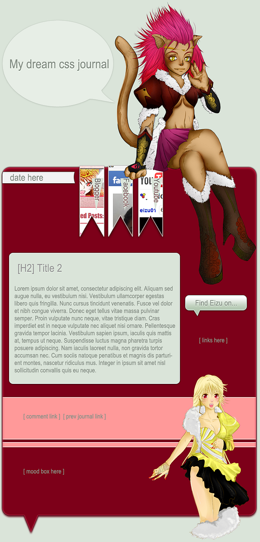
Well, to judge your first CSS, I would say its really a good piece! I like it! 
But there are certain things you should look after, sorry If I'm a bit picky! Actually I'm very perfectionist by nature...
1)As you already said, the comment background needs some fix (it's position is different in firefox and IE)
2) The design that you've put above and below the journal looks huge to me. So, if you see the journal in a lower resolution the images gets cut out from the right.
3)Yes, the sidebar needs a fix! As again, in lower resolution it overlaps with the main body text!
4)I think you should remove the hyperlink underline from the sidebar links! i.e. use no text decoration
5)Coding the mood list was good to do but I guess in this design it wasn't necessary, you probably could have put the mood list in the lower red part of the journal design with transparent backgrond and different font color
6) Try putting some padding in the thumbs and avatars. Or may be you can even put some borders along with hover color change.
Now don't get down-heart by seeing my the comments above because..
1) You've chosen smart font colors
2) The finish of your journal design is perfect
If you still need some assistance you can ask me.


